<Card><Heading as="h2" variant="heading20">Parable of the Talents</Heading><Paragraph>Choose your leaders with wisdom and forethought. To be led by a coward is to be controlled by all that the coward fears. To be led by a fool is to be ledby the opportunists who control the fool. To be led by a thief is to offer up your most precious treasures to be stolen. To be led by a liar is to ask to belied to. To be led by a tyrant is to sell yourself and those you love into slavery.</Paragraph><Paragraph marginBottom="space0">— <Anchor href="https://www.goodreads.com/book/show/60932.Parable_of_the_Talents">Octavia Butler</Anchor></Paragraph></Card>
Cards are specifically-styled containers that group related content and actions. Cards are a great tool for placing a concise amount of related information together in one object, much like a business card or baseball card in real life.
Card is an extremely flexible container that does not require specific components inside of it. You can compose a Card to support your use case, but elements such as Heading, Paragraph, and Button or Anchor are commonly used.
A Card does not handle any interactive events such as hover, click, or focus, though children composed inside of it may commonly have event handlers.
Acknowledging the flexibility of Card component, there are several non-negotiable properties of a Card that differentiate it from a more basic page-layout element, such as Box including background color, border width, border radius, and border color.
At its core, Card is a Box with specific styling attributes and more explicit use cases that you can find in Examples. If you find yourself limited by the default styling and constraints of a Card, you may consider using a Box instead, but first consider bringing the problem you are trying to solve to Design System Office Hours to see if another component or pattern could fit your needs.
An example of a Card with default padding.
<Card><Heading as="h2" variant="heading20">Parable of the Talents</Heading><Paragraph>Choose your leaders with wisdom and forethought. To be led by a coward is to be controlled by all that the coward fears. To be led by a fool is to be ledby the opportunists who control the fool. To be led by a thief is to offer up your most precious treasures to be stolen. To be led by a liar is to ask to belied to. To be led by a tyrant is to sell yourself and those you love into slavery.</Paragraph><Paragraph marginBottom="space0">— <Anchor href="https://www.goodreads.com/book/show/60932.Parable_of_the_Talents">Octavia Butler</Anchor></Paragraph></Card>
One of the most common use cases for a Card is to relate a title (Heading), supporting body copy (Paragraph), and primary action (Button) together. Relating these three elements together with a Card makes it easy for a user to digest and provides a clear call to action. Padding surrounding the inner content of a Card can be adjusted to suit the needs of your implementation.
<Stack orientation="vertical" spacing="space40"><Card padding="space120"><Heading as="h2" variant="heading20">The Transgender District</Heading><Paragraph>The mission of the Transgender District is to create an urban environment that fosters the rich history, culture, legacy, and empowerment of transgenderpeople and its deep roots in the southeastern Tenderloin neighborhood. The transgender district aims to stabilize and economically empower the transgendercommunity through ownership of homes, businesses, historic and cultural sites, and safe community spaces.</Paragraph><Button variant="primary" as="a" href="https://www.transgenderdistrictsf.com/">Support The Transgender District</Button></Card><Card padding="space120"><Heading as="h2" variant="heading20">Inside Out</Heading><Paragraph>Inside Out empowers, educates, and advocates for LGBTQ+ of youth from the Pikes Peak Region in Southern Colorado. Inside Out does this by creating safe spaces,support systems and teaching life skills to all youth in the community and working to make the community safer and more accepting of gender and sexual orientationdiversity.</Paragraph><Button variant="primary" as="a" href="https://insideoutys.org/">Support Inside Out</Button></Card><Card padding="space120"><Heading as="h2" variant="heading20">The Audre Lorde Project</Heading><Paragraph>The Audre Lorde Project is a Lesbian, Gay, Bisexual, Two Spirit, Trans and Gender Non Conforming People of Color center for community organizing, focusing onthe New York City area. Through mobilization, education and capacity-building, they work for community wellness and progressive social and economic justice. Committedto struggling across differences, they seek to responsibly reflect, represent and serve their various communities.</Paragraph><Button variant="primary" as="a" href="https://alp.org/">Support The Audre Lorde Project</Button></Card></Stack>
Your implementation use case may call for a Card with centered content. You can accommodate this by using the alignment props available on some components, or by creating a custom layout inside your Card using Box or Flex.
<Card padding="space200"><Text as="div" textAlign="center"><Paragraph>We want a world where boys can feel, girls can lead, and the rest of us can not only exist but thrive. This is notabout erasing men and women but rather acknowledging that man and woman are two of many—stars in a constellation thatdo not compete but amplify one another’s shine.</Paragraph><Paragraph marginBottom="space0">— <Anchor href="https://www.goodreads.com/book/show/51794301-beyond-the-gender-binary">Alok Vaid-Menon</Anchor></Paragraph></Text></Card>;
When a Card contains text content, use the following guidelines:
- Use a Heading to highlight the most important information.
- Use a Paragraph to add additional context. Do not repeat the information in the header. Front-load the most critical information.
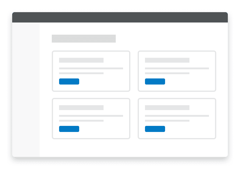
- When presenting multiple Cards of equal weight on a single page, structure each Card's content similarly.

Do
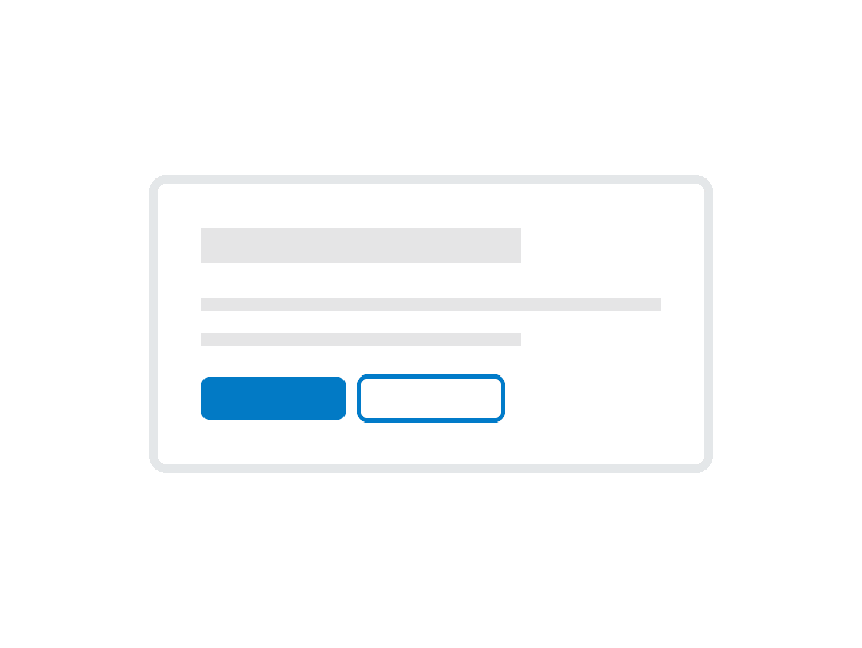
Have a clear call to action when including Buttons. Avoid including more than one primary and one secondary button.

Don't
Don’t put multiple primary actions in a Card

Do
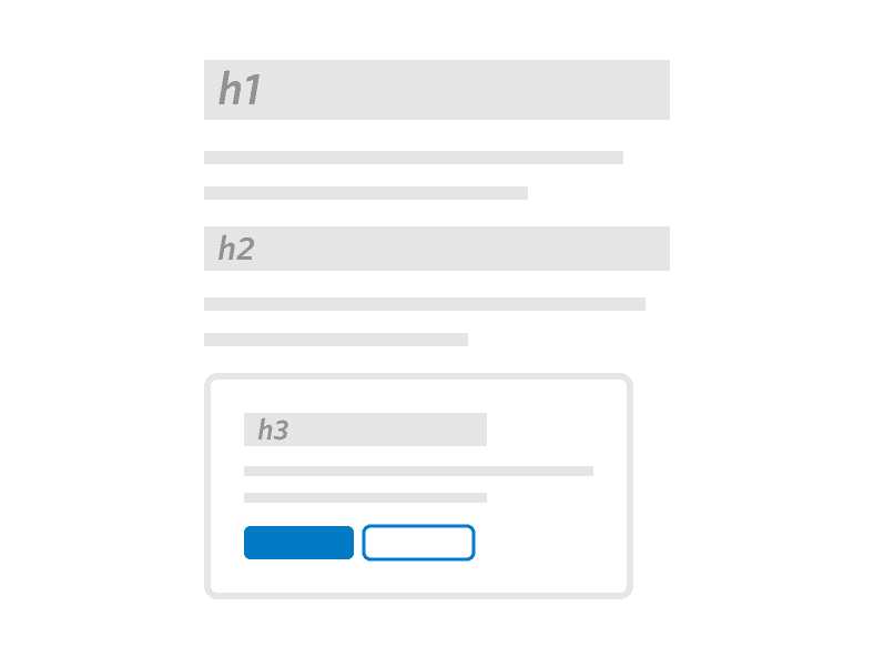
Use a Heading in your Card that appropriately reflects the information architecture of the page.

Don't
Don’t use Cards to highlight multiple primary actions on a single page.
Do
Use a Heading to set a clear expectation on the Card’s purpose.
Don't
Don’t place multiple Heading components in a single Card.
Do
Use a consistent location on the bottom of the Card for primary actions or next steps.